


This window will close in 10 seconds.
Please click here to close it now.


16:21:31
ENQUIRE
16:21:31
[ UK ]

LOADING...
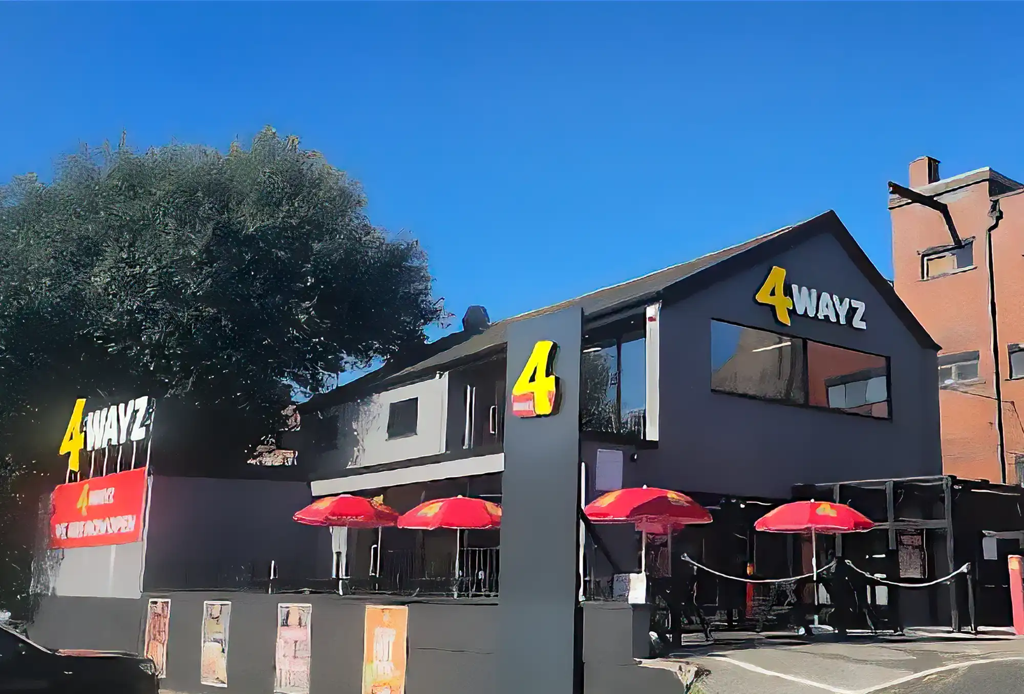
For 4 WAYZ, a bold new Blackburn food venue with street-style energy, we were brought in from the ground up to develop a comprehensive brand experience across every customer touchpoint. Starting with initial brand concepts, we defined the look, feel, and tone of 4 WAYZ through logos, colour systems, and bold graphic styling.
We then carried this identity through everything: exterior signage, high-impact promotional video campaigns, animated in-store screen content and custom designed menus and packaging. Each element was built not just to look good, but to create a cohesive, high-energy brand story that comes alive inside and out of the venue. Whether you're passing by a billboard or ordering at the counter, the brand is unmistakable, confident and built to make an impression.
LOADING...
Branding from Concept to Reality
We kicked off with a deep dive into what would make 4 WAYZ stand out. From name and tone through to logo development and visual direction, the branding had to feel fast-paced, urban and bold. Using a gritty-meets-modern aesthetic, we created a flexible identity system with strong typography, layered graphics, and bold use of colour.
The brand was designed to flex, from packaging to signage to digital screens. Always recognisable and energetic. The goal was a vibe customers would remember.
LOADING...
Promotional Billboards & Restaurant Screens
To make sure the launch had impact beyond the venue, we created a suite of high-energy promotional billboard animations, designed for maximum attention-grabbing potential in busy urban environments. These were supported by custom video content for use inside the restaurant; adding movement and life to the space.
Every frame was built to reinforce the brand’s bold personality, mixing fast cuts, bold colours, and punchy graphics. Whether outside on a billboard or inside on a screen, the energy stays consistent and the branding stays loud.
LOADING...
Menus and Uniform
Menus are more than lists, they are a visual extension of the brand. For 4 WAYZ, we crafted unique menu concepts that played with layout, hierarchy, and colour to create a fast-readable yet visually striking experience. From dine-in foldouts to wall-mounted menu boards, we carried through the brand’s bold energy while making sure readability and navigation were spot on.
Every menu design was tested for real-world use: easy to scan, intuitive to follow, and built to flex as the menu evolved. Designed with impact, but never at the cost of clarity. Alongside the menus, we also developed full uniform mockups to bring the brand into the team’s day-to-day presence.
LOADING...
Food Packaging & Branded Touchpoints
To round out the experience, we developed a series of branded food packaging designs; from burger wraps and boxes to bags and cups. Each item was built for functionality while still packing visual punch. We paid close attention to how each element would look in-hand, in photos and on delivery; ensuring the branding stayed strong in every customer interaction.
Combined with the signage, videos and menus, the packaging became the final layer in a fully unified brand experience. It’s not just packaging, it’s setting the brand apart from the competition.


