This window will close in 10 seconds.
Please click here to close it now.


16:21:31
ENQUIRE
16:21:31
[ UK ]

LOADING...
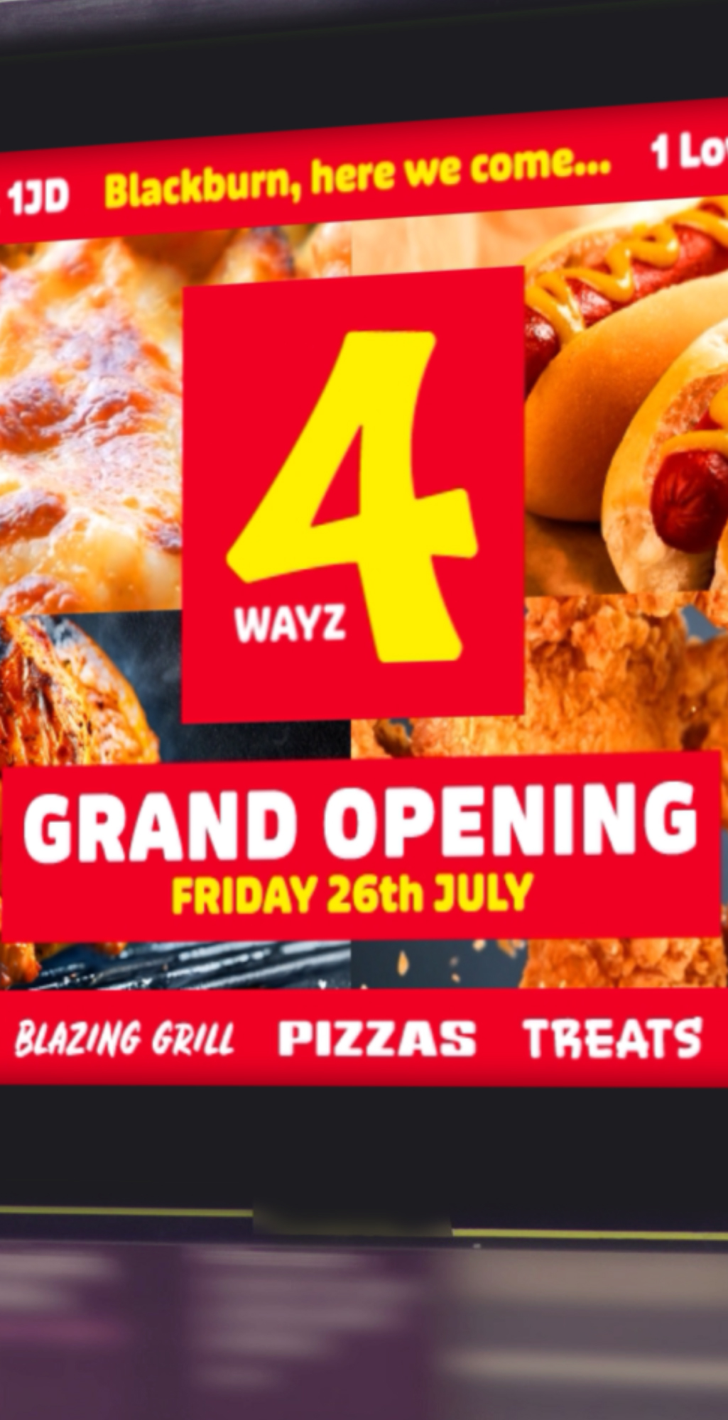
MyPak came to us with a bold mission - to create a standout brand and packaging suite for a growing range of food service products, including what would become the UK’s best-selling fried chicken box. We developed a full visual identity system from scratch, building a strong, confident logo and an adaptable design language that could scale across dozens of packaging formats, from burger wraps to pizza boxes. Each design had to balance shelf appeal with practicality - stackable, brandable and recognisable at a glance, even in busy takeaway environments.
This project wasn’t just about aesthetics; it was about strategic consistency and functional design that performs in the real world. From print finishes to cut lines, we handled every detail in-house, working closely with manufacturers to make sure every item looked as good on the shelf as it did in the brand guidelines. The result: packaging that’s clean, bold, and instantly MyPak.
LOADING...
UK's Best-Selling Fried Chicken Box
Iconic and instantly recognisable, the MyPak fried chicken box was designed to dominate counters, shelves, and customer memories. We created a clean, confident layout with bold typography and brand colours that pop - easy to spot, even from a distance. Every surface was considered, from lid graphics to interior flaps, making the entire unboxing experience cohesive and on-brand.
It's not just the most popular for its looks - its structure was also optimised for heat retention, stackability, and ease of use. Today, it stands as the UK’s go-to fried chicken box, and a testament to how thoughtful design drives real market success.
LOADING...
Function Meets Finish
Packaging needs to work just as well as it looks. We worked closely with suppliers to fine-tune every physical detail: fold lines, glue flaps, venting, and material finishes. Matte or gloss, kraft or coated - we tested variations to ensure the product didn’t just look premium, but held up in real use.
Whether stacked in kitchens or handed over a counter, each item was designed for durability, heat retention, and comfort in the hand. It’s thoughtful design from the inside out - engineered for both form and function, without compromise.
LOADING...
Bold, Scalable Brand System
With a growing product range, MyPak needed a design system that could stretch - both visually and practically. We built a flexible toolkit of logos, patterns, and type treatments that could adapt to boxes, wraps, trays, sleeves, and bags without losing visual coherence. Whether used in full colour or single-colour print, the branding remains strong and legible.
Every asset was created with manufacturing in mind - minimal ink waste, clean edges, and bold contrast. The result is a packaging system that scales effortlessly across SKUs while always reinforcing brand recognition in fast-paced food service settings.
LOADING...
Unifying Visual Identity
In a space where packaging is often overlooked, we gave MyPak a distinct, confident personality. The brand identity is sharp, minimal, and recognisably bold - anchored by strong geometry and a no-nonsense typographic voice. Across all packaging, the design system provides just enough variation to feel fresh, while maintaining visual consistency from one product to the next.
This cohesion builds trust with both businesses and customers - delivering a professional look that says: this is food packaging done properly. It’s not flashy - it’s effective, considered, and unapologetically MyPak.