


This window will close in 10 seconds.
Please click here to close it now.


16:21:31
ENQUIRE
16:21:31
[ UK ]

LOADING...
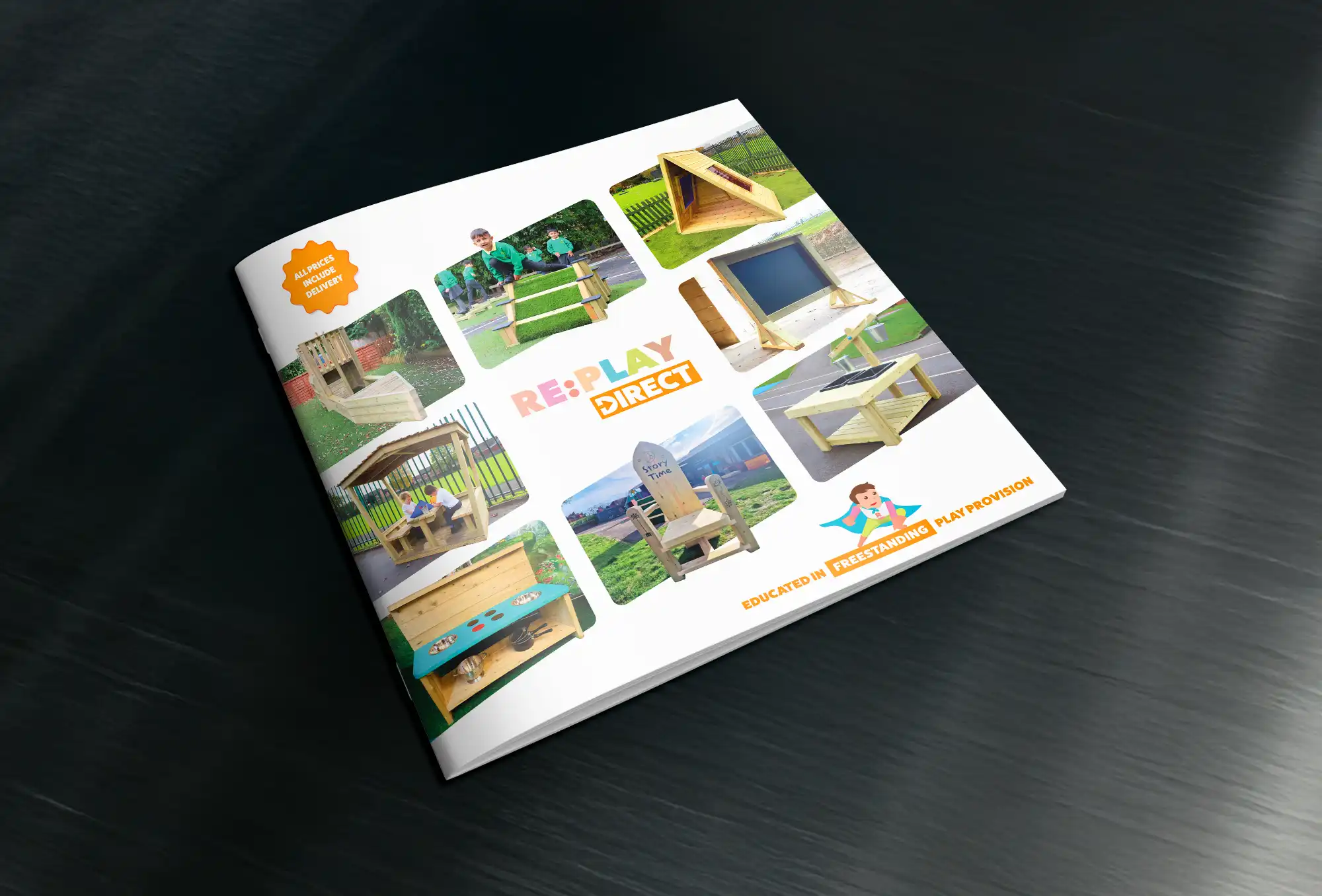
Replay Direct needed a printed product brochure that matched the energy and style of their brand; something that would stand out in schools, conferences and at customer meetings. We were tasked with designing a piece that was equal parts catalogue and conversation starter, showcasing their evolving product range in a format that felt modern, bold, friendly and clean. The layout was designed to guide the reader through clear product sections while consistently highlighting the brand's identity.
We focused on large-format visuals, structured grid systems, and plenty of breathing space to match the premium aesthetic of their products. Finishing touches, such as print stock selection, colour matching, and image retouching, were handled in-house to ensure maximum control over the final output. From design concept through to press delivery, this was a fully managed process. The result is a tactile, beautifully printed brochure that captures the look and feel of the Replay Direct brand.
LOADING...
Clean and Clear Layout
We approached the layout design with clarity and confidence in mind. Strong typographic hierarchies, precise spacing, and structured grids allowed us to present detailed product information without overwhelming the reader.
Visuals were given space to shine and each section flows naturally to the next, creating a rhythm that guides the user intuitively. We designed with a customer-focused mindset: this needed to look good flat on a desk, folded in a bag, or handed to a client. The result is a brochure that feels professional, modern, and unmistakably Replay.
LOADING...
Full-Service Print Management
Print quality can make or break a brochure, so we handled it all. From stock selection and finishes to press proofs and final production, we managed every step of the process to ensure the design translated perfectly from screen to paper.
We chose a heavyweight silk stock for a premium feel, with crisp image reproduction and strong colour fidelity. Every fold, trim, and margin was checked for consistency. This wasn’t just about printing, it was about delivering a final product that felt deliberate, refined, and ready to represent the brand at the highest level.
LOADING...
Product-Focused Visual Storytelling
The brochure was designed as a tool to help Replay’s products speak for themselves. We used large-format imagery, clear specifications and simple graphic icons to create a clean visual narrative. Each product section was carefully paced, with consistent styling that makes comparing items easy and enjoyable.
The imagery was curated and retouched to ensure consistency in lighting, tone and perspective across the range. It’s not just about aesthetics, it’s about helping customers engage with the products quickly and confidently, whether they’re flipping through casually or studying the details.
LOADING...
Branded to the Core
This wasn’t just a product catalogue, it was a brand piece. Every aspect of the brochure reinforces Replay Direct’s visual identity, from colour palettes and typography to iconography and layout structure. The tone is clean and self-assured, with just the right amount of personality.
We wanted this brochure to feel like an extension of their digital presence, but with the tactile quality that only print can offer. It’s the kind of collateral that leaves a lasting impression and becomes something customer want to hold onto.


