
This project was all about punchy flavour and even punchier visuals. Tasked with bringing three new drinks - R'fresh, Limont and 1Hundred - to life in an extremely competitive market, we developed bold, energetic branding systems that demanded attention across shelves, screens, and streets. From initial concept to final rollout, we created everything: logo design, colour palettes, packaging artwork, and full-scale outdoor promotions including billboards, signage, and bus stop posters.
Each visual element was crafted to appeal to a wide, dynamic audience - using vibrant tones, expressive typography, and clear visual storytelling. Whether it was a chilled can in a fridge or a backlit ad on the high street, the branding needed to grab attention fast and leave a lasting impression. This was more than just design - it was visual strategy in motion, tailored to different retail and public environments. The result is three distinct, striking identities that work hard across every touchpoint, turning casual glances into brand recognition and brand recognition into repeat sales.
Power & Edge – 1Hundred Drink Branding
1Hundred was designed to feel bold, confident, and high-energy - a cola that doesn’t just quench thirst, it makes a statement. We approached this design with attitude in mind, using deep blues, reds, and white to reflect intensity and sleek coolness. The logo strikes a balance between streetwear influence and modern minimalism, with strong typographic lines that hold up across any size or medium.
The can features layered textures and graphic accents that give it depth and a sense of motion, while the overall visual tone says: this drink is full-on, no half measures. It’s cola with confidence - built to turn heads.
Crisp & Zesty – Limont Drink Identity
Limont is the citrus kick in the line-up - refreshing, fun, and unmistakably sharp. We gave it a brand identity that reflects that feeling: bright lime and lemon hues, playful geometric shapes and a clean, uplifting logo with curved edges and bold indications of the flavours. The can design bursts with freshness, using overlapping waves and high-contrast blocks to echo the fizz and clarity of the drink itself.
Typography is clean and breezy, supporting the easy-drinking, no-nonsense vibe. The whole design is about quick recognition and crave appeal - something that pops in the fridge and delivers instant citrus energy before you’ve even cracked the can.
Juiced-Up Classic – R'fresh Orange Drink Design
The R'fresh Orange drink needed to capture the familiar appeal of orange soda while giving it a modern, vibrant edge. We built the design around rich oranges and sun-kissed yellows, layered with colourful textures and bursts that reflect the juiciness of the flavour.
The logo is punchy but approachable, paired with circular accents that nod to fruit slices and effervescence. We kept the layout simple but expressive - designed to jump off shelves and deliver flavour through visuals alone. It’s a modern refresh of a nostalgic classic, with design that says: sweet, bright, and ready to go.
High-Impact Outdoor Advertising
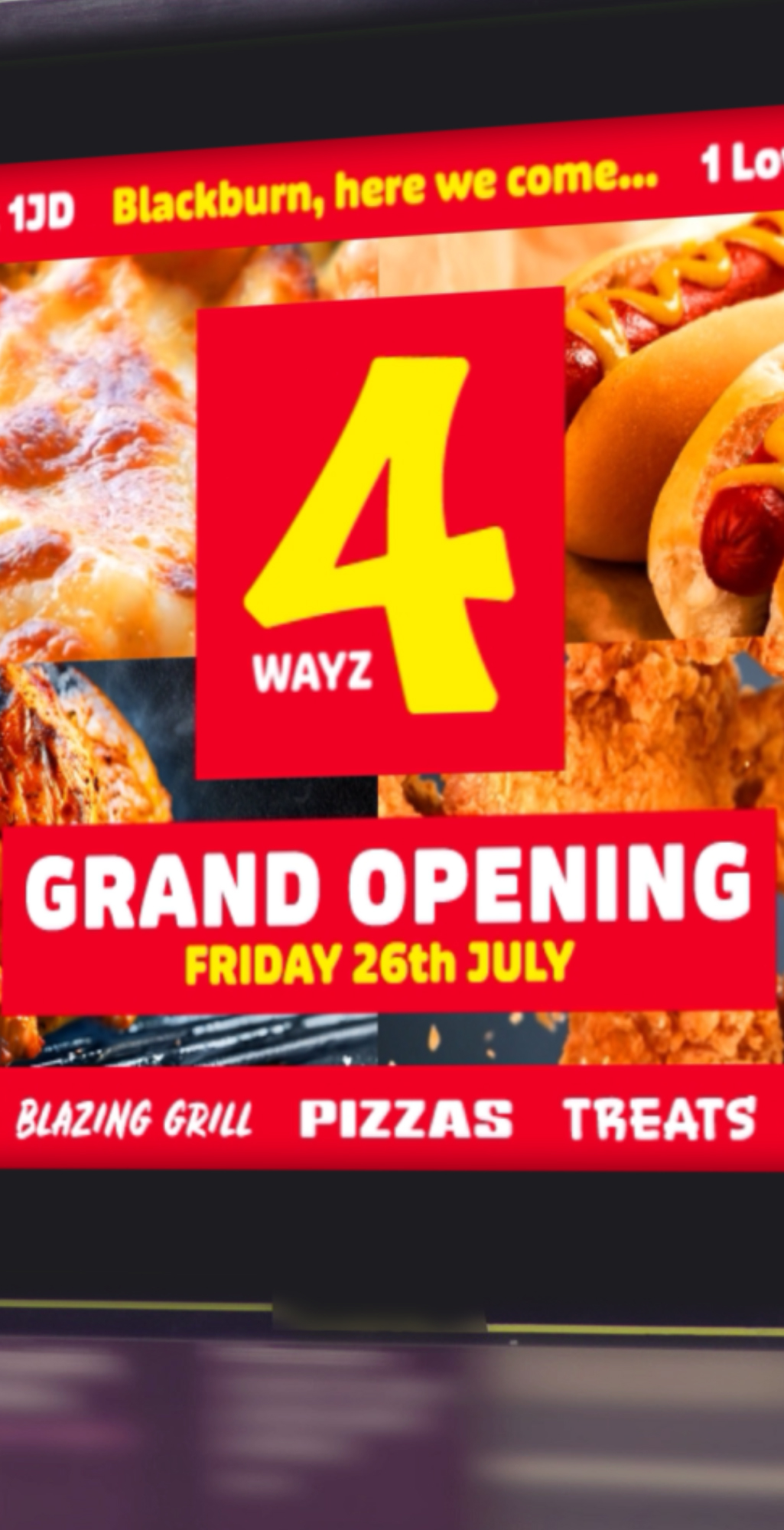
Taking the branding off the shelf and into the streets, we rolled out a suite of promotional materials designed for impact at scale. Billboards, bus stop ads, and retail signage were all crafted with fast readability in mind - distilling the energy of each product into split-second visual impressions.
We played with composition and hierarchy to make sure each piece hit hard whether viewed from a passing car or at close range. These weren’t just ads - they were brand experiences at street level.


